

AWS CloudWatch is a corner service used by almost all AWS Service teams for monitoring and scaling software systems. Though it is a foundational software service that most businesses could benefit from, CloudWatch’s features are unintuitive and therefore often overlooked.
Out of the box, CloudWatch offers users the ability to plot both standard infrastructure and custom application metrics. However, new users can easily make the fatal mistake of plotting their graphs using the default statistic: average. Stop right there! Instead of averages, use percentiles. By switching the statistic type, you are bound to uncover operational issues that have been hiding right underneath your nose.
In this post, you’ll learn:
- About the averages that can hide performance issues
- Why software teams favor percentiles
- How percentiles are calculated.
Example scenario: Slowness hiding in plain sight
Imagine the following scenario between a product manager, A, and an engineer, B, both of them working for SmallBusiness.
A sends B a slack message, alerting B that customers are reporting slowness with CoffeeAPI:
A: “Hey — some of our customers are complaining. They’re saying that CoffeeAPI is slower than usual”.
B: “One second, taking a look…”
B signs into the AWS Console and pulls up the CloudWatch dashboard. Once the page loads, he scrolls down to the specific graph that plots CoffeeAPI latency, execution_runtime_in_ms
He quickly reviews the graph for the relevant time period, the last 24 hours.
There’s no performance issue, or so it seems. Latencies sit below the team defined threshold, all data points below the 600 milliseconds threshold:
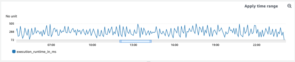
B: “Um…Look good to me” B reports back.
A: “Hmm…customers are definitely saying the system takes as long as 900ms…”
Switching up the statistic from avg to p90
In B’s mind, he has a gut feeling that something’s off — something isn’t adding up. Are customers misreporting issues?
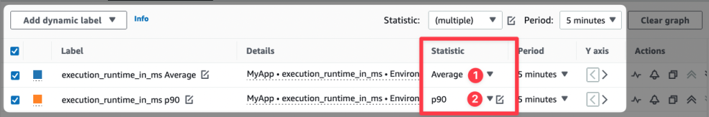
Second guessing himself, B modifies the line graph, duplicating the `execution_runtine_in_ms` metric. He tweaks one setting -under the **statistic** field, he swaps out Average for P90.
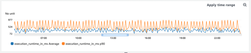
He refreshes the page and boom — there it is: datapoints revealing latency above 600 milliseconds!
Some customers’ requests are even taking as long as 998 milliseconds, 300+ milliseconds above the team’s defined service level operation (SLO).
Problematic averages
Using CloudWatch metrics may seem simple at first. But it’s not that intuitive. What’s more is that by default, CloudWatch plots metrics with the average as the default statistic. As we saw above, this can hide outliers.
Plans based on assumptions about average conditions usually go wrong.
Sam Savage
For any given metric with multiple data points, the average may show no change in behavior throughout the day, when really, there are significant changes.
Here’s another example: let’s say we want to measure the number of requests per second.
Sounds simple,right? Not so fast.
First we need to talk measurements. Do we measure once a second, or by averaging requests over a minute? As we have already discovered, averaging requests can hide higher latencies that arrive in small bursts. Let’s consider a 60 second period as an example. If during the first 30 seconds there are 200 requests per second, and during the last 30 seconds there are zero requests per second, then the average would be 100 requests per second. However, in reality, the “instantaneous load” is twice that amount if there are 200 requests/s in odd-numbered seconds and 0 in others.
How to use Percentiles
Using percentiles makes for smoother software.
Swapping out average for percentile is advantageous for two reasons:
- metrics are not skewed by outliers and just as important
- every percentile data is an actual user experience, not a computed value like average
Continuing with the above example of a metric that tracks execution time, imagine an application publishing the following data points:
[535, 400, 735, 999, 342, 701, 655, 373, 248, 412]
If you average the above data, it comes out to 540 milliseconds, yet for the P90, we get 999 milliseconds. Here’s how we arrived at that number:
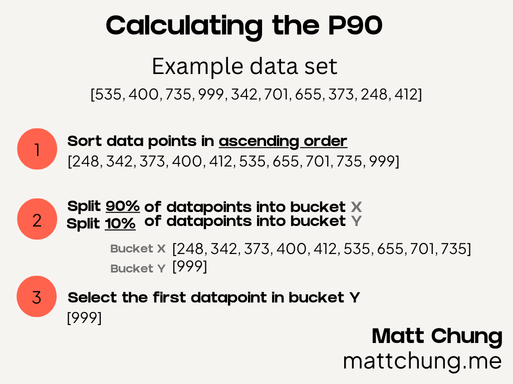
Let’s look at the above graphic in order to calculate the p90. First, start with sorting all the data points for a given time period, sorting them in ascending order from lowest to highest. Next, split the data points into two buckets. If you want the P90, you split the first 90% of data points into bucket one, and the remaining 10% into bucket two. Similarly, if you want the P50 (i.e. the median), assign 50% of the data points to the first bucket and 50% into the second.
Finally, after separating the data points into the two buckets, you select the first datapoint in the second bucket. The same steps can be applied to any percentile (e.g. P0, P50, P99).
Some common percentiles that you can use are p0, p50, p90, p99 and p99.9. You’ll want to use different percentiles for different alarm thresholds (more on this in an upcoming blog post). Say you are exploring CPU utilization, the p0, p50, and p100 give you the lowest usage, medium usage, and highest usage, respectively.
Summary
To conclude, let’s make sure that you’re using percentiles instead of averages so that when you use CloudWatch, you aren’t getting false positives.
Take your existing graphs and switch over your statistics from average to percentile today, and start uncovering hidden operational issues. Let me know if you make the change and how it positively impacts your systems.
References
Chris Jones. “Google – Site Reliability Engineering.” Accessed September 12, 2022. https://sre.google/sre-book/service-level-objectives/.
Smith, Dave. “How to Metric.” Medium (blog), September 24, 2020. https://medium.com/@djsmith42/how-to-metric-edafaf959fc7.